2023-11-12 76
效果图:
爱心跳动案例 主要是通过 定位 以及关键帧动画 分别实现爱心的制作 和跳动 接下来进行分析
html:
设置一个盒子 里面写入一个span标签 爱心的主体通过 box的after和before加上定位进行设置 
先将盒子通过 定位加transform进行水平垂直居中 并将伪类的共同样式写好
 .box {
        position: absolute;
        top: 50%;
        left: 50%;
        transform: translate(-50%, -50%);
        width: 150px;
        height: 150px;
      }
      .box::before,
      .box::after {
        content: "";
        position: absolute;
        top: 0;
        width: 105px;
        height: 150px;
        background: #ff3e3e;
        border-radius: 50% 50% 0 0;
      }
预览:
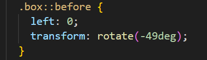
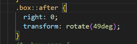
接下来加上对伪类分别进行位置移动
before 左边:

after 右边:

接下来就是通过span对爱心的那片反光进行设置了 通过定位的方式 移动到对应的区域
      .box span {
        background-color: rgba(255, 255, 255, 0.5);
        width: 35px;
        height: 15px;
        border-radius: 40%;
        display: inline-block;
        position: absolute;
        right: 15px;
        top: 25px;
        z-index: 5;
      }
      .box span:after {
        content: "";
        position: absolute;
        bottom: -2px;
        width: 130%;
        background-color: #ff3e3e;
        height: 11px;
        border-radius: 50% 50% 0 0;
        left: 50%;
        transform: translateX(-50%);
      }
最后就是对爱心跳动时的动画设置了 就是通过transform:scal{}方法对爱心进行方法缩小
    @keyframes slide {
        0% {
          transform: translate(-50%, -50%) scale(1, 1);
        }
        30% {
          transform: translate(-50%, -50%) scale(1.1, 1.1);
        }
        50% {
          transform: translate(-50%, -50%) scale(1, 1);
        }
        75% {
          transform: translate(-50%, -50%) scale(1.1, 1.1);
        }
        80% {
          transform: translate(-50%, -50%) scale(1, 1);
        }
        100% {
          transform: translate(-50%, -50%) scale(1, 1);
        }
      }
完整代码:
<!DOCTYPE html>
<html lang="en">
  <head>
    <meta charset="UTF-8" />
    <meta name="viewport" content="width=device-width, initial-scale=1.0" />
    <title>CSS3爱心跳动</title>
    <style>
      * {
        padding: 0;
        margin: 0;
      }
      body {
        background: #000;
      }
      .box {
        position: absolute;
        top: 50%;
        left: 50%;
        transform: translate(-50%, -50%);
        width: 150px;
        height: 150px;
        animation: slide 1s linear infinite;
      }
      .box::before,
      .box::after {
        content: "";
        position: absolute;
        top: 0;
        width: 105px;
        height: 150px;
        background: #ff3e3e;
        border-radius: 50% 50% 0 0;
      }
      .box::before {
        left: 0;
        transform: rotate(-49deg);
      }
      .box::after {
        right: 0;
        transform: rotate(49deg);
      }
      .box span {
        background-color: rgba(255, 255, 255, 0.5);
        width: 35px;
        height: 15px;
        border-radius: 40%;
        display: inline-block;
        position: absolute;
        right: 15px;
        top: 25px;
        z-index: 5;
      }
      .box span:after {
        content: "";
        position: absolute;
        bottom: -2px;
        width: 130%;
        background-color: #ff3e3e;
        height: 11px;
        border-radius: 50% 50% 0 0;
        left: 50%;
        transform: translateX(-50%);
      }
    @keyframes slide {
        0% {
          transform: translate(-50%, -50%) scale(1, 1);
        }
        30% {
          transform: translate(-50%, -50%) scale(1.1, 1.1);
        }
        50% {
          transform: translate(-50%, -50%) scale(1, 1);
        }
        75% {
          transform: translate(-50%, -50%) scale(1.1, 1.1);
        }
        80% {
          transform: translate(-50%, -50%) scale(1, 1);
        }
        100% {
          transform: translate(-50%, -50%) scale(1, 1);
        }
      }
    </style>
  </head>
  <body>
    <div class="box">
      <span></span>
    </div>
  </body>
</html>原文链接:http://1.15.94.33/?id=197
=========================================
http://1.15.94.33/ 为 “前端日记簿” 唯一官方服务平台,请勿相信其他任何渠道。
Jquery 2022-12-02
Jquery 2022-12-02
Vue 2023-06-02
Jquery 2022-12-02
Vue 2023-07-14
Vue 2023-06-02
Vue 2023-07-07
Vue 2023-07-19
Vue 2023-07-03
Vue 2023-07-26
扫码二维码
获取最新动态