2023-11-14 73
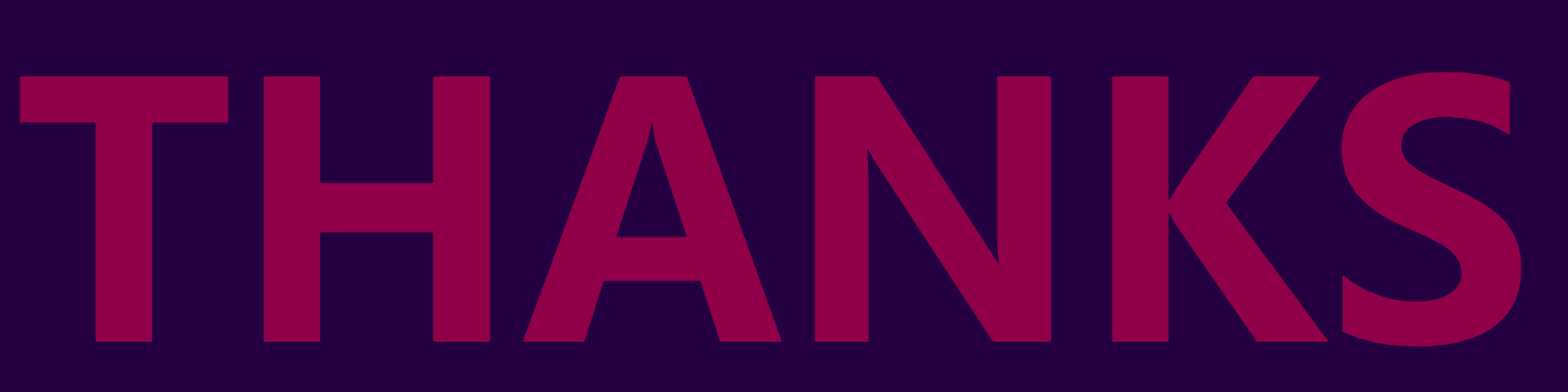
效果图:
从效果中可以看到 字母进行的不同节奏的颜色变化 类似于霓虹灯一样进行闪烁
html:
h1标签中 将字母单独用span进行包裹
在css中先将基础样式进行设置 文字主要靠关键帧动画实现效果的
      body {
        margin: 0;
        display: flex;
        height: 100vh;
        background: #240041;
        font-family: Montserrat, sans-serif;
      }

      h1 {
        margin: auto;
        font-size: 20vw;
        text-align: center;
        text-transform: uppercase;
        color: #900048;
        white-space: nowrap;
        letter-spacing: -0.15em;
      }
预览:
关键帧动画这次我们不进行0% 100% 这种头尾设置 简单来说 就是头尾的颜色都是它的基本样式 在动画中间进行设置

最后只需要给我们的span进行动画绑定 以及设置好不同的延时 即可
    span:nth-child(1) {
        animation: blink 1s steps(1, start) 0.33s infinite;
      }

      span:nth-child(2) {
        animation: blink 1s steps(1, start) 0.66s infinite;
      }

      span:nth-child(3) {
        animation: blink 1s steps(1, start) 0.33s infinite;
      }

      span:nth-child(4) {
        animation: blink 1s steps(1, start) 0.66s infinite;
      }

      span:nth-child(5) {
        animation: blink 1s steps(1, start) 0.33s infinite;
      }

      span:nth-child(6) {
        animation: blink 1s steps(1, start) 0.66s infinite;
      }
完整代码:
<html>
  <head>
    <meta charset="utf-8" />
    <title>css3字符动画</title>

    <style>
      body {
        margin: 0;
        display: flex;
        height: 100vh;
        background: #240041;
        font-family: Montserrat, sans-serif;
      }

      h1 {
        margin: auto;
        font-size: 20vw;
        text-align: center;
        text-transform: uppercase;
        color: #900048;
        white-space: nowrap;
        letter-spacing: -0.15em;
      }

      span:nth-child(1) {
        animation: blink 1s steps(1, start) 0.33s infinite;
      }

      span:nth-child(2) {
        animation: blink 1s steps(1, start) 0.66s infinite;
      }

      span:nth-child(3) {
        animation: blink 1s steps(1, start) 0.33s infinite;
      }

      span:nth-child(4) {
        animation: blink 1s steps(1, start) 0.66s infinite;
      }

      span:nth-child(5) {
        animation: blink 1s steps(1, start) 0.33s infinite;
      }

      span:nth-child(6) {
        animation: blink 1s steps(1, start) 0.66s infinite;
      }

       @keyframes blink {
        33% {
          color: #ff4057;
        }
        66% {
          color: #ff8260;
        }
      }
    </style>
  </head>
  <body>
    <h1>
      <span>T</span>
      <span>h</span>
      <span>a</span>
      <span>n</span>
      <span>k</span>
      <span>s</span>
    </h1>
  </body>
</html>原文链接:http://1.15.94.33/?id=202
=========================================
http://1.15.94.33/ 为 “前端日记簿” 唯一官方服务平台,请勿相信其他任何渠道。
Jquery 2022-12-02
Jquery 2022-12-02
Vue 2023-06-02
Jquery 2022-12-02
Vue 2023-07-14
Vue 2023-06-02
Vue 2023-07-07
Vue 2023-07-19
Vue 2023-07-03
Vue 2023-07-26
扫码二维码
获取最新动态