2023-11-16 80
效果图:
当鼠标按下按钮时 按钮文本会发生变化 并且 上面的能量条 会进行充能 每个阶段的充能颜色条不同 当松开时 能量条进行衰减 火箭进行加速
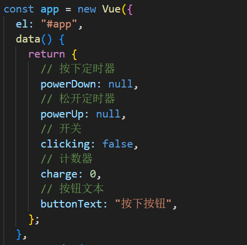
先创建一个vue实例 在数据中心中 将我们需要的变量数据写好
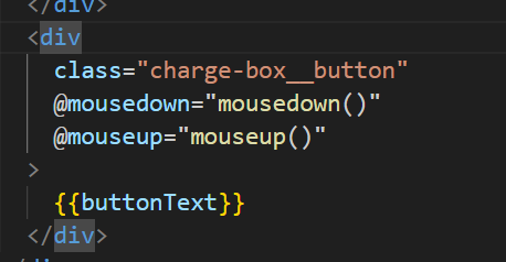
当我们按下按钮时 给对应绑定是事件进行处理
视图层:
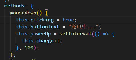
首先将开关设置为true 文本改为充电中 拿到数据中心的powerUp设置为间隔定时器 每100ms 计数器charge++一次
当我们松开的时候去设置mouseup鼠标事件 更改按钮样式 关闭开关 先清理掉 powerUp定时器 将powerDown设置为定时器 也是隔100ms进行一次charge--
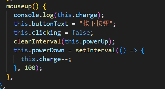
我们在进入mousedown方法的时候 也需要将powerDown定时器进行清除

接下来就是给能量条改变样式 以及宽度
视图层:
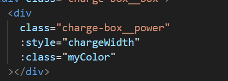
我们声明一个变量 用于接收 当前数据中心中的change 并且乘以2 设置为能量条的宽度 进行赋值

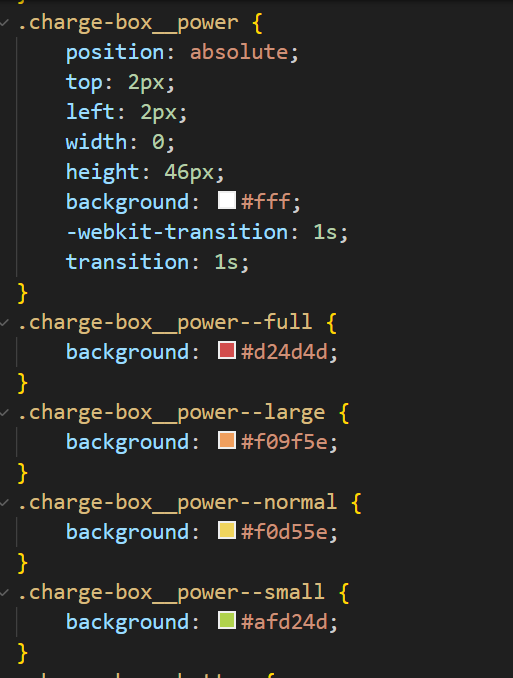
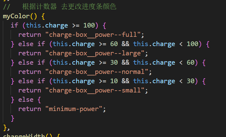
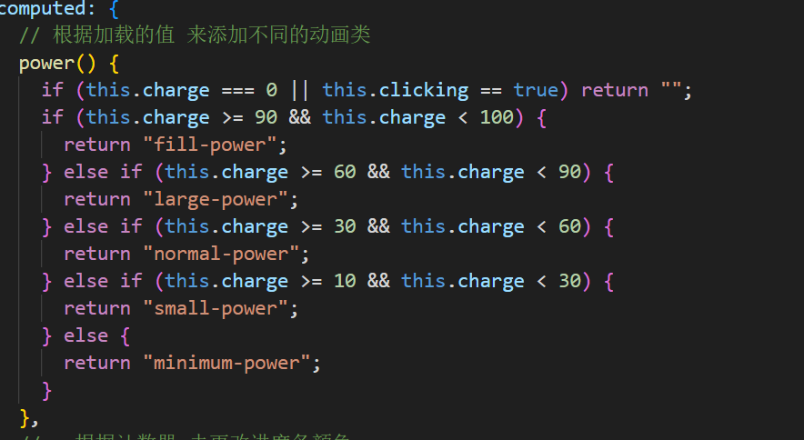
颜色的改变的话 在css中设置五个背景颜色 在计算属性中 设置一个方法 对change进行判断
给每一个颜色一个区间值 当change等于那个区间时 返回一个对应颜色的类
css:
计算属性:
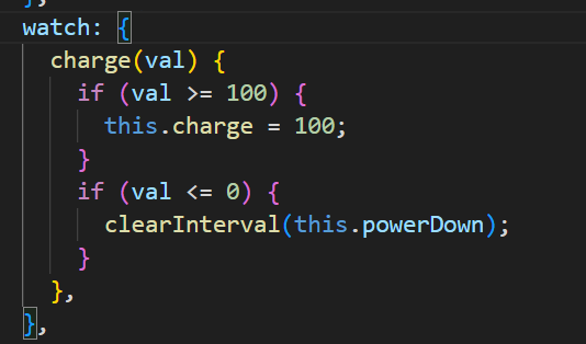
我们在watch中去监听change值的变化 当它的值大于等于100时 就等于100
小于等于零时 清除掉powerDown定时器 让它停止衰减
最后的小球动画 还是跟能量条颜色相同的操作 当change到达if判断的一个区间值时 返回对应的类进行动画
完整代码:
html:
    <div id="app">
      <div class="wrapper" :class="power">
        <div class="charge-box">
          <div class="charge-box__box">
            <div
              class="charge-box__power"
              :style="chargeWidth"
              :class="myColor"
            ></div>
          </div>
          <div
            class="charge-box__button"
            @mousedown="mousedown()"
            @mouseup="mouseup()"
          >
            {{buttonText}}
          </div>
        </div>
        <div class="rocket">
          <div class="rocket__body">
            <div class="rocket__inner"></div>
          </div>
          <div class="rocket__wing rocket__wing--center"></div>
          <div class="rocket__wing rocket__wing--right"></div>
          <div class="rocket__wing rocket__wing--left"></div>
          <div class="rocket__fire"></div>
        </div>
        <div class="lines">
          <div class="line"></div>
          <div class="line"></div>
          <div class="line"></div>
          <div class="line"></div>
          <div class="line"></div>
          <div class="line"></div>
          <div class="line"></div>
          <div class="line"></div>
          <div class="line"></div>
          <div class="line"></div>
        </div>
      </div>
    </div>
css:
@import url("https://fonts.googleapis.com/css?family=Cute+Font&display=swap");
* {
    padding: 0;
    margin: 0;
}
html,
body {
    width: 100%;
    height: 100%;
    margin: 0;
    overflow: hidden;
}

body {
    background: #333;
    color: #fff;
    font-family: "Cute Font", cursive;
}

#app {
    width: 100%;
    height: 100%;
    padding: 30px;
    box-sizing: border-box;
}

* {
    -webkit-transition: 0.8s;
    transition: 0.8s;
}
*:before,
*:after {
    content: "";
    position: absolute;
}

.wrapper {
    position: relative;
    width: 100%;
    height: 100%;
}

.rocket {
    position: absolute;
    top: calc(50% - 150px);
    left: calc(50% - 35px);
    width: 70px;
    height: 110px;
    -webkit-transform-origin: top center;
    transform-origin: top center;
    -webkit-animation: 1s alternate infinite rocket;
    animation: 1s alternate infinite rocket;
}
.rocket__body {
    position: absolute;
    top: 0;
    left: 10px;
    width: 50px;
    height: 100px;
    overflow: hidden;
    border-radius: 90% 90% 0 0;
    z-index: 10;
}
.rocket__inner {
    width: 50px;
    height: 115px;
    border-radius: 90%;
    background: #fff;
    overflow: hidden;
}
.rocket__inner:before {
    top: 35px;
    left: 14px;
    width: 20px;
    height: 20px;
    border-radius: 50%;
    border: 3px solid #aaa;
    background: #71b2ce;
    box-sizing: border-box;
}
.rocket__inner:after {
    top: -5px;
    left: 10px;
    width: 30px;
    height: 25px;
    border-radius: 50%;
    background: #f05e5e;
}
.rocket__wing {
    position: absolute;
    top: 70px;
    background: #f05e5e;
    width: 45px;
    height: 20px;
}
.rocket__wing--right {
    right: -10px;
    -webkit-transform: rotate(45deg);
    transform: rotate(45deg);
    border-radius: 0 90% 0 0;
}
.rocket__wing--left {
    left: -10px;
    -webkit-transform: rotate(-45deg);
    transform: rotate(-45deg);
    border-radius: 90% 0 0 0;
}
.rocket__wing--center {
    top: 70px;
    left: 28px;
    width: 12px;
    height: 40px;
    border-radius: 50%;
    z-index: 10;
}
.rocket__fire {
    position: absolute;
    top: 122px;
    left: 15px;
    background: #f05e5e;
    width: 40px;
    height: 40px;
    border-radius: 90% 0 90% 90%;
    -webkit-transform: scale(0.6) translateY(10px) rotate(-45deg);
    transform: scale(0.6) translateY(10px) rotate(-45deg);
}
.rocket__fire:before {
    top: 7px;
    left: 14px;
    background: orange;
    width: 20px;
    height: 20px;
    border-radius: 90% 0 90% 90%;
    z-index: 10;
    -webkit-animation: 1s alternate infinite fire2;
    animation: 1s alternate infinite fire2;
}
.rocket__fire:after {
    top: -2px;
    left: -4px;
    width: 44px;
    height: 48px;
    border-radius: 50%;
    background: #f05e5e;
    -webkit-transform: rotate(45deg);
    transform: rotate(45deg);
    -webkit-animation: 1s alternate infinite fire;
    animation: 1s alternate infinite fire;
}

.charge-box {
    position: absolute;
    bottom: 10px;
    left: calc(50% - 102px);
    display: -webkit-box;
    display: flex;
    -webkit-box-pack: center;
    justify-content: center;
    -webkit-box-orient: vertical;
    -webkit-box-direction: normal;
    flex-flow: column;
    -webkit-box-align: center;
    align-items: center;
}
.charge-box__box {
    width: 200px;
    height: 46px;
    border: 2px solid #fff;
    overflow: hidden;
    margin-bottom: 20px;
}
.charge-box__box:after {
    content: "MAX";
    top: -30px;
    right: -15px;
    font-size: 25px;
}
.charge-box__power {
    position: absolute;
    top: 2px;
    left: 2px;
    width: 0;
    height: 46px;
    background: #fff;
    -webkit-transition: 1s;
    transition: 1s;
}
.charge-box__power--full {
    background: #d24d4d;
}
.charge-box__power--large {
    background: #f09f5e;
}
.charge-box__power--normal {
    background: #f0d55e;
}
.charge-box__power--small {
    background: #afd24d;
}
.charge-box__button {
    width: 150px;
    display: -webkit-box;
    display: flex;
    -webkit-box-align: center;
    align-items: center;
    -webkit-box-pack: center;
    justify-content: center;
    padding: 10px;
    background: #f05e5e;
    color: #fff;
    font-size: 30px;
    cursor: pointer;
    box-sizing: border-box;
    user-select: none;
    -webkit-user-select: none;
    -moz-user-select: none;
    -ms-user-select: none;
}
.charge-box__button:hover {
    opacity: 0.8;
}

.small-power .rocket__fire {
    -webkit-transform: scale(1) translateY(10px) rotate(-45deg);
    transform: scale(1) translateY(10px) rotate(-45deg);
}
.small-power .line:nth-of-type(1),
.small-power .line:nth-of-type(4) {
    -webkit-animation: 3s ease-in-out 0.6s infinite line;
    animation: 3s ease-in-out 0.6s infinite line;
}
.small-power .line:nth-of-type(2),
.small-power .line:nth-of-type(7) {
    -webkit-animation: 3s ease-in-out 1.8s infinite line;
    animation: 3s ease-in-out 1.8s infinite line;
}
.small-power .line:nth-of-type(3),
.small-power .line:nth-of-type(9) {
    -webkit-animation: 3s ease-in-out 2.7s infinite line;
    animation: 3s ease-in-out 2.7s infinite line;
}
.small-power .line:nth-of-type(5),
.small-power .line :nth-of-type(10) {
    -webkit-animation: 3s ease-in-out 1.2s infinite line;
    animation: 3s ease-in-out 1.2s infinite line;
}
.small-power .line:nth-of-type(6),
.small-power .line:nth-of-type(8) {
    -webkit-animation: 3s ease-in-out 0.3s infinite line;
    animation: 3s ease-in-out 0.3s infinite line;
}

.normal-power .rocket {
    -webkit-animation: 3.5s alternate moveNormal;
    animation: 3.5s alternate moveNormal;
}
.normal-power .rocket__fire {
    -webkit-transform: scale(1.1) translateY(10px) rotate(-45deg);
    transform: scale(1.1) translateY(10px) rotate(-45deg);
}
.normal-power .line:nth-of-type(1),
.normal-power .line:nth-of-type(4) {
    -webkit-animation: 2s ease-in-out 0.4s infinite line;
    animation: 2s ease-in-out 0.4s infinite line;
}
.normal-power .line:nth-of-type(2),
.normal-power .line:nth-of-type(7) {
    -webkit-animation: 2s ease-in-out 1.2s infinite line;
    animation: 2s ease-in-out 1.2s infinite line;
}
.normal-power .line:nth-of-type(3),
.normal-power .line:nth-of-type(9) {
    -webkit-animation: 2s ease-in-out 1.8s infinite line;
    animation: 2s ease-in-out 1.8s infinite line;
}
.normal-power .line:nth-of-type(5),
.normal-power .line :nth-of-type(10) {
    -webkit-animation: 2s ease-in-out 0.8s infinite line;
    animation: 2s ease-in-out 0.8s infinite line;
}
.normal-power .line:nth-of-type(6),
.normal-power .line:nth-of-type(8) {
    -webkit-animation: 2s ease-in-out 1.6s infinite line;
    animation: 2s ease-in-out 1.6s infinite line;
}

.large-power .rocket {
    -webkit-animation: 3s alternate moveLarge;
    animation: 3s alternate moveLarge;
}
.large-power .rocket__fire {
    -webkit-transform: scale(1.2) translateY(10px) rotate(-45deg);
    transform: scale(1.2) translateY(10px) rotate(-45deg);
}
.large-power .line:nth-of-type(1),
.large-power .line:nth-of-type(4) {
    -webkit-animation: 1s ease-in-out 0.2s infinite line;
    animation: 1s ease-in-out 0.2s infinite line;
}
.large-power .line:nth-of-type(2),
.large-power .line:nth-of-type(7) {
    -webkit-animation: 1s ease-in-out 0.6s infinite line;
    animation: 1s ease-in-out 0.6s infinite line;
}
.large-power .line:nth-of-type(3),
.large-power .line:nth-of-type(9) {
    -webkit-animation: 1s ease-in-out 0.3s infinite line;
    animation: 1s ease-in-out 0.3s infinite line;
}
.large-power .line:nth-of-type(5),
.large-power .line :nth-of-type(10) {
    -webkit-animation: 1s ease-in-out 0.4s infinite line;
    animation: 1s ease-in-out 0.4s infinite line;
}
.large-power .line:nth-of-type(6),
.large-power .line:nth-of-type(8) {
    -webkit-animation: 1s ease-in-out 0.8s infinite line;
    animation: 1s ease-in-out 0.8s infinite line;
}

.fill-power .rocket {
    -webkit-animation: 1s alternate moveFull;
    animation: 1s alternate moveFull;
}
.fill-power .rocket__fire {
    -webkit-transform: scale(1.5) translateY(10px) rotate(-45deg);
    transform: scale(1.5) translateY(10px) rotate(-45deg);
}
.fill-power .line:nth-of-type(1),
.fill-power .line:nth-of-type(4) {
    -webkit-animation: 0.5s ease-in-out 0.1s infinite line;
    animation: 0.5s ease-in-out 0.1s infinite line;
}
.fill-power .line:nth-of-type(2),
.fill-power .line:nth-of-type(7) {
    -webkit-animation: 0.5s ease-in-out 0.3s infinite line;
    animation: 0.5s ease-in-out 0.3s infinite line;
}
.fill-power .line:nth-of-type(3),
.fill-power .line:nth-of-type(9) {
    -webkit-animation: 0.5s ease-in-out 0.5s infinite line;
    animation: 0.5s ease-in-out 0.5s infinite line;
}
.fill-power .line:nth-of-type(5),
.fill-power .line :nth-of-type(10) {
    -webkit-animation: 0.5s ease-in-out 0.2s infinite line;
    animation: 0.5s ease-in-out 0.2s infinite line;
}
.fill-power .line:nth-of-type(6),
.fill-power .line:nth-of-type(8) {
    -webkit-animation: 0.5s ease-in-out 0.4s infinite line;
    animation: 0.5s ease-in-out 0.4s infinite line;
}

.line {
    position: absolute;
    top: -90px;
    width: 1px;
    height: 60px;
    background: #fff;
    -webkit-transform-origin: bottom;
    transform-origin: bottom;
}
.line:nth-of-type(1) {
    left: 10%;
    -webkit-animation: 5s ease-in-out 0s infinite line;
    animation: 5s ease-in-out 0s infinite line;
}
.line:nth-of-type(2) {
    left: 20%;
    -webkit-animation: 5s ease-in-out 3s infinite line;
    animation: 5s ease-in-out 3s infinite line;
}
.line:nth-of-type(3) {
    -webkit-animation: 5s ease-in-out 5s infinite line;
    animation: 5s ease-in-out 5s infinite line;
    left: 30%;
}
.line:nth-of-type(4) {
    -webkit-animation: 5s ease-in-out 1s infinite line;
    animation: 5s ease-in-out 1s infinite line;
    left: 40%;
}
.line:nth-of-type(5) {
    -webkit-animation: 5s ease-in-out 2s infinite line;
    animation: 5s ease-in-out 2s infinite line;
    left: 50%;
}
.line:nth-of-type(6) {
    -webkit-animation: 5s ease-in-out 4s infinite line;
    animation: 5s ease-in-out 4s infinite line;
    left: 60%;
}
.line:nth-of-type(7) {
    -webkit-animation: 5s ease-in-out 3s infinite line;
    animation: 5s ease-in-out 3s infinite line;
    left: 70%;
}
.line:nth-of-type(8) {
    -webkit-animation: 5s ease-in-out 1s infinite line;
    animation: 5s ease-in-out 1s infinite line;
    left: 80%;
}
.line:nth-of-type(9) {
    -webkit-animation: 5s ease-in-out 5s infinite line;
    animation: 5s ease-in-out 5s infinite line;
    left: 90%;
}
.line:nth-of-type(10) {
    -webkit-animation: 5s ease-in-out 2s infinite line;
    animation: 5s ease-in-out 2s infinite line;
    left: 100%;
}

@keyframes line {
    0% {
        -webkit-transform: translateY(-90px);
        transform: translateY(-90px);
    }
    100% {
        -webkit-transform: translateY(1000px);
        transform: translateY(1000px);
    }
}
@-webkit-keyframes line {
    0% {
        -webkit-transform: translateY(-90px);
        transform: translateY(-90px);
    }
    100% {
        -webkit-transform: translateY(1000px);
        transform: translateY(1000px);
    }
}
@keyframes fire {
    0% {
        -webkit-transform: rotate(45deg) translateY(0px);
        transform: rotate(45deg) translateY(0px);
    }
    100% {
        -webkit-transform: rotate(45deg) translateY(5px);
        transform: rotate(45deg) translateY(5px);
    }
}
@-webkit-keyframes fire {
    0% {
        -webkit-transform: rotate(45deg) translateY(0px);
        transform: rotate(45deg) translateY(0px);
    }
    100% {
        -webkit-transform: rotate(45deg) translateY(5px);
        transform: rotate(45deg) translateY(5px);
    }
}
@keyframes fire2 {
    0% {
        -webkit-transform: scale(0.5);
        transform: scale(0.5);
    }
    100% {
        -webkit-transform: scale(1);
        transform: scale(1);
    }
}
@-webkit-keyframes fire2 {
    0% {
        -webkit-transform: scale(0.5);
        transform: scale(0.5);
    }
    100% {
        -webkit-transform: scale(1);
        transform: scale(1);
    }
}
@keyframes rocket {
    0% {
        -webkit-transform: translateY(0px);
        transform: translateY(0px);
    }
    100% {
        -webkit-transform: translateY(10px);
        transform: translateY(10px);
    }
}
@-webkit-keyframes rocket {
    0% {
        -webkit-transform: translateY(0px);
        transform: translateY(0px);
    }
    100% {
        -webkit-transform: translateY(10px);
        transform: translateY(10px);
    }
}
@keyframes moveFull {
    0% {
        -webkit-transform: translateY(0) rotate(0);
        transform: translateY(0) rotate(0);
    }
    10% {
        -webkit-transform: translateY(-30px) rotate(10deg);
        transform: translateY(-30px) rotate(10deg);
    }
    45% {
        -webkit-transform: translateY(-20px) rotate(-10deg);
        transform: translateY(-20px) rotate(-10deg);
    }
    65% {
        -webkit-transform: translateY(50px) rotate(0);
        transform: translateY(50px) rotate(0);
    }
    100% {
        -webkit-transform: translateY(0) rotate(0);
        transform: translateY(0) rotate(0);
    }
}
@-webkit-keyframes moveFull {
    0% {
        -webkit-transform: translateY(0) rotate(0);
        transform: translateY(0) rotate(0);
    }
    10% {
        -webkit-transform: translateY(-30px) rotate(10deg);
        transform: translateY(-30px) rotate(10deg);
    }
    45% {
        -webkit-transform: translateY(-20px) rotate(-10deg);
        transform: translateY(-20px) rotate(-10deg);
    }
    65% {
        -webkit-transform: translateY(50px) rotate(0);
        transform: translateY(50px) rotate(0);
    }
    100% {
        -webkit-transform: translateY(0) rotate(0);
        transform: translateY(0) rotate(0);
    }
}
@keyframes moveLarge {
    0% {
        -webkit-transform: translateY(0) rotate(0);
        transform: translateY(0) rotate(0);
    }
    10% {
        -webkit-transform: translateY(-30px) rotate(10deg);
        transform: translateY(-30px) rotate(10deg);
    }
    45% {
        -webkit-transform: translateY(-20px) rotate(-10deg);
        transform: translateY(-20px) rotate(-10deg);
    }
    65% {
        -webkit-transform: translateY(50px) rotate(0);
        transform: translateY(50px) rotate(0);
    }
    100% {
        -webkit-transform: translateY(0) rotate(0);
        transform: translateY(0) rotate(0);
    }
}
@-webkit-keyframes moveLarge {
    0% {
        -webkit-transform: translateY(0) rotate(0);
        transform: translateY(0) rotate(0);
    }
    10% {
        -webkit-transform: translateY(-30px) rotate(10deg);
        transform: translateY(-30px) rotate(10deg);
    }
    45% {
        -webkit-transform: translateY(-20px) rotate(-10deg);
        transform: translateY(-20px) rotate(-10deg);
    }
    65% {
        -webkit-transform: translateY(50px) rotate(0);
        transform: translateY(50px) rotate(0);
    }
    100% {
        -webkit-transform: translateY(0) rotate(0);
        transform: translateY(0) rotate(0);
    }
}
@keyframes moveNormal {
    0% {
        -webkit-transform: translateY(0) rotate(0);
        transform: translateY(0) rotate(0);
    }
    10% {
        -webkit-transform: translateY(-30px) rotate(10deg);
        transform: translateY(-30px) rotate(10deg);
    }
    45% {
        -webkit-transform: translateY(-20px) rotate(-10deg);
        transform: translateY(-20px) rotate(-10deg);
    }
    65% {
        -webkit-transform: translateY(50px) rotate(0);
        transform: translateY(50px) rotate(0);
    }
    100% {
        -webkit-transform: translateY(0) rotate(0);
        transform: translateY(0) rotate(0);
    }
}
@-webkit-keyframes moveNormal {
    0% {
        -webkit-transform: translateY(0) rotate(0);
        transform: translateY(0) rotate(0);
    }
    10% {
        -webkit-transform: translateY(-30px) rotate(10deg);
        transform: translateY(-30px) rotate(10deg);
    }
    45% {
        -webkit-transform: translateY(-20px) rotate(-10deg);
        transform: translateY(-20px) rotate(-10deg);
    }
    65% {
        -webkit-transform: translateY(50px) rotate(0);
        transform: translateY(50px) rotate(0);
    }
    100% {
        -webkit-transform: translateY(0) rotate(0);
        transform: translateY(0) rotate(0);
    }
}原文链接:http://1.15.94.33/?id=210
=========================================
http://1.15.94.33/ 为 “前端日记簿” 唯一官方服务平台,请勿相信其他任何渠道。
Jquery 2022-12-02
Jquery 2022-12-02
Vue 2023-06-02
Jquery 2022-12-02
Vue 2023-07-14
Vue 2023-06-02
Vue 2023-07-07
Vue 2023-07-19
Vue 2023-07-03
Vue 2023-07-26
扫码二维码
获取最新动态