2023-11-17 77
效果图:
动画中 文字从右侧向左侧进行移动并且到俩处交接点时移动过来的文字更改颜色
html:
在box内部设置于两个div 作为左右面 内部设置span并且文字相同

我们先将box以及内部的div基础样式 设置好 通过transform的方式 进行旋转 并且设置好景深
      body {
        height: 100vh;
        display: flex;
        justify-content: center;
        align-items: center;
        background: #eedead;
      }
      .box {
        display: flex;
      }
      .box .left,
      .box .right {
        width: 400px;
        height: 200px;
        line-height: 200px;
        font-size: 60px;
        font-family: "sans-serif";
        white-space: nowrap;
        font-weight: bold;
        overflow: hidden;
      }
      .box .left {
        background: indianred;
        color: darkred;
        transform-origin: right;
        transform: perspective(100px) rotateY(-15deg);
      }
      .box .right {
        background-color: lightcoral;
        color: antiquewhite;
        transform-origin: left;
        transform: perspective(100px) rotateY(15deg);
      }
预览:
接下来就是设置好动画
将它添加到span上面 因为是通过left进行动画 所以要给span设置好定位
并且我们要给左边的动画进行延时设置 并且先将span移出
    .box .left span,
      .box .right span {
        position: absolute;
        animation: slide 5s linear infinite;
      }
      .box .left span {
        animation-delay: 2.5s;
        left: -100%;
      }
完整代码:
<!DOCTYPE html>
<html lang="en">
<head>
<meta charset="UTF-8" />
<meta name="viewport" content="width=device-width, initial-scale=1.0" />
<title>css3循环滚动文字代码</title>
<style>
* {
padding: 0;
margin: 0;
}
body {
height: 100vh;
display: flex;
justify-content: center;
align-items: center;
background: #eedead;
}
.box {
display: flex;
}
.box .left,
.box .right {
width: 400px;
height: 200px;
line-height: 200px;
font-size: 60px;
font-family: "sans-serif";
white-space: nowrap;
font-weight: bold;
overflow: hidden;
}
.box .left {
background: indianred;
color: darkred;
transform-origin: right;
transform: perspective(100px) rotateY(-15deg);
}
.box .right {
background-color: lightcoral;
color: antiquewhite;
transform-origin: left;
transform: perspective(100px) rotateY(15deg);
}
.box .left span,
.box .right span {
position: absolute;
animation: slide 5s linear infinite;
}
.box .left span {
animation-delay: 2.5s;
left: -100%;
}
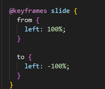
@keyframes slide {
from {
left: 100%;
}
to {
left: -100%;
}
}
</style>
</head>
<body>
<div class="box">
<div class="left">
<span>Hello World</span>
</div>
<div class="right">
<span>Hello World</span>
</div>
</div>
</body>
</html>原文链接:http://1.15.94.33/?id=212
=========================================
http://1.15.94.33/ 为 “前端日记簿” 唯一官方服务平台,请勿相信其他任何渠道。
Jquery 2022-12-02
Jquery 2022-12-02
Vue 2023-06-02
Jquery 2022-12-02
Vue 2023-07-14
Vue 2023-06-02
Vue 2023-07-07
Vue 2023-07-19
Vue 2023-07-03
Vue 2023-07-26
扫码二维码
获取最新动态