2023-11-23 87
效果图:

案例中的俩种颜色的小圆球 旋转效果图 我们通过vue去动态的创建节点 通过添加关键帧动画让它进行旋转 以及缩放
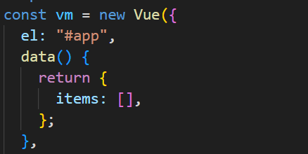
现在根实例中创建一个空数组为items
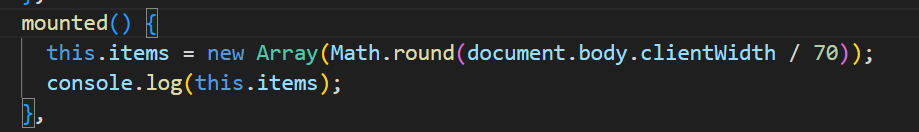
然后在钩子函数中对items进行赋值 new一个数组对象 通过获取文档宽度除以70 来获取一个值 作为数组的值
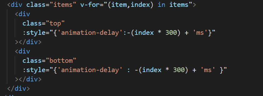
最后我们只要将items数组在试图从中 进行遍历 并且内部写入俩个div 作为俩种不同的圆球 分别给它们设置好延时
完整代码:
<!DOCTYPE html>
<html lang="en">
  <head>
    <meta charset="UTF-8" />
    <meta name="viewport" content="width=device-width, initial-scale=1.0" />
    <title>vue DNA螺旋粒子动画特效</title>
    <style>
      * {
        padding: 0;
        margin: 0;
      }
      body {
        background: #f7f7f7;
      }

      #app {
        position: relative;
      }
      .dna {
        position: fixed;
        top: 50%;
        left: 50%;
        transform: translate(-50%, -50%);
        width: 90%;
        height: 250px;
        text-align: center;
        overflow: hidden;
      }
      .items {
        position: relative;
        margin: 0px 5px;
        width: 50px;
        height: 250px;
        display: inline-block;
      }
      .items div {
        position: absolute;
        top: 0;
        left: 0;
        width: 50px;
        height: 50px;
        border-radius: 50%;
        background: #5e0035;
        animation: slide1 4s ease-in-out infinite;
      }
      .items .bottom {
        top: auto;
        bottom: 0;
        background: #5c80bc;
        animation: slide2 4s ease-in-out infinite;
      }
      @keyframes slide1 {
        0% {
          transform: scale(0.5);
          top: 0;
          z-index: 10;
          opacity: 0.75;
        }
        25% {
          transform: scale(1);
          opacity: 1;
        }
        50% {
          transform: scale(0.5);
          top: 200px;
          z-index: 0;
          opacity: 0.75;
        }
        75% {
          transform: scale(0.25);
          opacity: 0.5;
        }
        100% {
          transform: scale(0.5);
          top: 0;
          opacity: 0.75;
        }
      }
      @keyframes slide2 {
        0% {
          transform: scale(0.5);
          bottom: 0;
          opacity: 0.75;
        }
        25% {
          transform: scale(0.25);
          opacity: 0.5;
        }
        50% {
          transform: scale(0.5);
          bottom: 200px;
          opacity: 0.75;
        }
        75% {
          transform: scale(1);
          opacity: 1;
        }
        100% {
          transform: scale(0.5);
          bottom: 0;
          opacity: 0.75;
        }
      }
    </style>
  </head>
  <body>
    <div id="app">
      <div class="dna">
        <div class="items" v-for="(item,index) in items">
          <div
            class="top"
            :style="{'animation-delay':-(index * 300) + 'ms'}"
          ></div>
          <div
            class="bottom"
            :style="{'animation-delay' : -(index * 300) + 'ms' }"
          ></div>
        </div>
      </div>
    </div>
  </body>
</html>
<script src="./js/vue.js"></script>
<script>
  const vm = new Vue({
    el: "#app",
    data() {
      return {
        items: [],
      };
    },
    mounted() {
      this.items = new Array(Math.round(document.body.clientWidth / 70));
      console.log(this.items);
    },
  });
</script>原文链接:http://1.15.94.33/?id=224
=========================================
http://1.15.94.33/ 为 “前端日记簿” 唯一官方服务平台,请勿相信其他任何渠道。
Jquery 2022-12-02
Jquery 2022-12-02
Vue 2023-06-02
Jquery 2022-12-02
Vue 2023-07-14
Vue 2023-06-02
Vue 2023-07-07
Vue 2023-07-19
Vue 2023-07-03
Vue 2023-07-26
扫码二维码
获取最新动态