2023-12-02 65
效果图:
在案例中 仿一个飞机窗口的特效 可以看见窗户外面的白云在进行移动 当点击上面的窗户时 可以进行一个关闭的效果
html:
在box中 外面将top作为窗户关闭的门板 cloud作为白云 通过css进行修饰
 <div class="box">
      <div class="top"></div>
      <div class="glass">
        <div class="sky">
          <div class="cloud"></div>
          <div class="cloud"></div>
          <div class="cloud"></div>
          <div class="cloud"></div>
          <div class="cloud"></div>
          <div class="cloud"></div>
        </div>
      </div>
    </div>
css:
* {
padding: 0;
margin: 0;
}
body {
position: relative;
display: flex;
justify-content: center;
align-items: center;
height: 100vh;
background: silver;
}
.box {
position: relative;
padding: 20px;
border: 4px solid #808080;
border-radius: 48px;
background: #d9d9d9;
box-shadow: inset 0 0 80px rgba(0, 0, 0, 0.2), 0 0 0 40px whitesmoke, 0 0 0 44px #808080, 0 20px 40px 40px rgba(0, 0, 0, 0.1);
overflow: hidden;
}
.box:before {
content: "";
position: absolute;
top: -10px;
left: 0;
height: 20px;
width: 100%;
background: black;
opacity: 0.2;
filter: blur(10px);
z-index: 20;
}
.top {
position: absolute;
left: 0;
top: -90%;
width: 100%;
height: 100%;
border-radius: 48px;
background: whitesmoke;
box-shadow: 0 0 0 4px #808080, 0 0 30px rgba(0, 0, 0, 0.4);
transition: all 0.6s ease-in-out;
cursor: pointer;
z-index: 10;
}
.top.closed {
top: -5%;
}
.top:before {
content: "";
display: block;
width: 40%;
height: 8px;
position: absolute;
bottom: 16px;
left: 50%;
transform: translateX(-50%);
border-radius: 4px;
background-color: #808080;
}
.top:after {
content: "";
display: block;
width: 16px;
height: 8px;
position: absolute;
bottom: 16px;
left: 50%;
transform: translateX(-50%);
border-radius: 4px;
background-image: radial-gradient(#5df254, #15a10c);
animation: light 1s ease infinite;
}
.glass {
position: relative;
width: 200px;
height: 300px;
border-radius: 72px;
box-shadow: 0 0 0 4px #808080;
overflow: hidden;
}
.glass:after {
content: "";
width: 100%;
height: 100%;
position: absolute;
top: 0;
left: 0;
background-image: radial-gradient(circle farthest-corner at 90% 10%, rgba(255, 255, 255, 0.4) 0%, rgba(0, 0, 0, 0) 20%);
box-shadow: inset 0 0 60px rgba(0, 0, 0, 0.2);
border-radius: 72px;
}
.sky {
position: relative;
background: #3fa9f5;
width: 100%;
height: 100%;
z-index: 0;
}
.cloud {
position: relative;
width: 100px;
height: 40px;
background-color: #fff;
border-radius: 40px;
animation: slide 2s linear infinite;
}
.cloud:before,
.cloud:after {
position: absolute;
content: "";
width: 40px;
height: 40px;
border-radius: 50%;
background: #fff;
}
.cloud:before {
top: -20px;
left: 20px;
}
.cloud:after {
top: -10px;
left: 50px;
}
@keyframes slide {
0% {
left: -200%;
}
100% {
left: 150%;
}
}
@keyframes light {
0% {
box-shadow: 0 0 0px #5df254;
}
50% {
box-shadow: 0 0 20px #5df254;
}
80% {
box-shadow: 0 0 40px rgba(93, 242, 84, 0);
}
}
.cloud:nth-child(1) {
animation-duration: 8s;
}
.cloud:nth-child(2) {
top: 20%;
animation-delay: 0.2s;
animation-duration: 6s;
}
.cloud:nth-child(3) {
top: 40%;
animation-duration: 4s;
}
.cloud:nth-child(4) {
top: 60%;
animation-duration: 6s;
}
.cloud:nth-child(5) {
top: 20%;
transform: scale(3);
animation-duration: 4s;
animation-delay: 2s;
}
.cloud:nth-child(6) {
top: 20%;
transform: scale(2);
animation-duration: 4s;
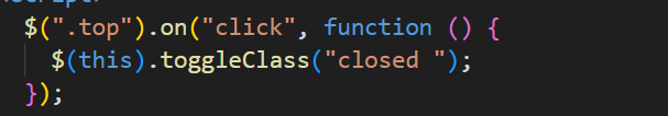
}js中 通过给top添加点击事件 当被点击时 通过toggleClass 对类进行一个添加删除 从而实现 关窗开窗的效果
原文链接:http://1.15.94.33/?id=238
=========================================
http://1.15.94.33/ 为 “前端日记簿” 唯一官方服务平台,请勿相信其他任何渠道。
Jquery 2022-12-02
Jquery 2022-12-02
Vue 2023-06-02
Jquery 2022-12-02
Vue 2023-07-14
Vue 2023-06-02
Vue 2023-07-07
Vue 2023-07-19
Vue 2023-07-03
Vue 2023-07-26
扫码二维码
获取最新动态