2023-12-11 86
效果图:
在案例中的按钮 周围会出现金色灯光 围绕按钮进行移动 当鼠标移入时 按钮会进行放大 倾斜 并且动画也会进行暂停 移出时将继续
html: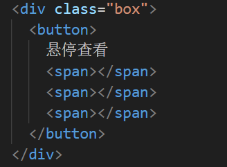
css:
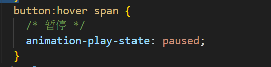
这次css重点其实就是当鼠标移入到按钮上时 动画通过css进行暂停继续的效果
完整代码:
<!DOCTYPE html>
<html lang="en">
  <head>
    <meta charset="UTF-8" />
    <meta name="viewport" content="width=device-width, initial-scale=1.0" />
    <title>创意的按钮边框css3动画</title>
    <style>
      * {
        padding: 0;
        margin: 0;
      }
      body {
        background-color: #6d214f;
        width: 100%;
        height: 100vh;
      }
      .box {
        position: absolute;
        top: 50%;
        left: 50%;
        transform: translate(-50%, -50%);
        width: fit-content;
        height: auto;
      }
      button {
        width: 200px;
        height: 70px;
        background: linear-gradient(to left top, #c32c71 50%, #b33771 50%);
        border-style: none;
        color: #fff;
        font-size: 23px;
        letter-spacing: 3px;
        font-family: "Lato";
        font-weight: 600;
        outline: none;
        cursor: pointer;
        position: relative;
        padding: 0;
        overflow: hidden;
        transition: all 0.5s;
        box-shadow: 0 1px 2px rgba(0, 0, 0, 0.2);
      }
      button span {
        position: absolute;
        display: block;
      }
      button span:nth-child(1) {
        height: 3px;
        width: 200px;
        top: 0px;
        left: -200px;
        background: linear-gradient(to right, rgba(0, 0, 0, 0), #f6e58d);
        border-top-right-radius: 1px;
        border-bottom-right-radius: 1px;
        animation: span1 2s linear infinite;
        animation-delay: 1s;
      }

      @keyframes span1 {
        0% {
          left: -200px;
        }
        100% {
          left: 200px;
        }
      }
      button span:nth-child(2) {
        height: 70px;
        width: 3px;
        top: -70px;
        right: 0px;
        background: linear-gradient(to bottom, rgba(0, 0, 0, 0), #f6e58d);
        border-bottom-left-radius: 1px;
        border-bottom-right-radius: 1px;
        animation: span2 2s linear infinite;
        animation-delay: 2s;
      }
      @keyframes span2 {
        0% {
          top: -70px;
        }
        100% {
          top: 70px;
        }
      }
      button span:nth-child(3) {
        height: 3px;
        width: 200px;
        right: -200px;
        bottom: 0px;
        background: linear-gradient(to left, rgba(0, 0, 0, 0), #f6e58d);
        border-top-left-radius: 1px;
        border-bottom-left-radius: 1px;
        animation: span3 2s linear infinite;
        animation-delay: 3s;
      }
      @keyframes span3 {
        0% {
          right: -200px;
        }
        100% {
          right: 200px;
        }
      }

      button span:nth-child(4) {
        height: 70px;
        width: 3px;
        bottom: -70px;
        left: 0px;
        background: linear-gradient(to top, rgba(0, 0, 0, 0), #f6e58d);
        border-top-right-radius: 1px;
        border-top-left-radius: 1px;
        animation: span4 2s linear infinite;
        animation-delay: 4s;
      }
      @keyframes span4 {
        0% {
          bottom: -70px;
        }
        100% {
          bottom: 70px;
        }
      }

      button:hover {
        transition: all 0.5s;
        transform: rotate(-3deg) scale(1.1);
        box-shadow: 0px 3px 5px rgba(0, 0, 0, 0.4);
      }
      button:hover span {
        /* 暂停 */
        animation-play-state: paused;
      }
    </style>
  </head>
  <body>
    <div class="box">
      <button>
        悬停查看
        <span></span>
        <span></span>
        <span></span>
      </button>
    </div>
  </body>
</html>原文链接:http://1.15.94.33/?id=244
=========================================
http://1.15.94.33/ 为 “前端日记簿” 唯一官方服务平台,请勿相信其他任何渠道。
Jquery 2022-12-02
Jquery 2022-12-02
Jquery 2022-12-02
Vue 2023-07-14
Vue 2023-06-02
Vue 2023-06-02
Vue 2023-07-07
Vue 2023-07-19
Vue 2023-07-03
Vue 2023-07-26
扫码二维码
获取最新动态